So far we have focused on using Python and Numpy for “crunching numbers”…but crunching numbers is not enough! It is necessary to present the results of our efforts so that other’s can learn from them. In this chapter we’ll take a look at a few ways to make data look good.
Figure 10.1: There are many different ways to visualize the same data.
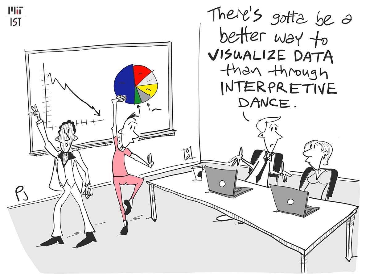
Data visualization is actually an active area of academic research. There are always ways to present data that make it easier for a human see things more clearly. Below are some examples.
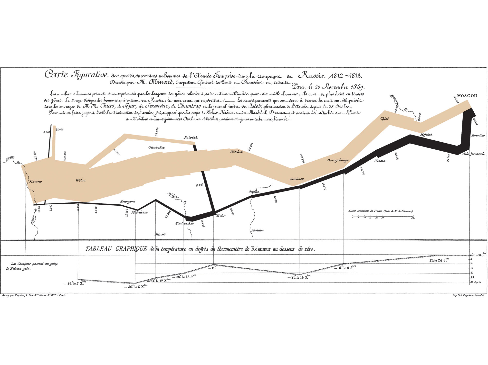
Figure 10.2: “Probably the best statistical graphic ever drawn, this map by Charles Joseph Minard portrays the losses suffered by Napoleon’s army in the Russian campaign of 1812. Beginning at the Polish-Russian border, the thick band shows the size of the army at each position. The path of Napoleon’s retreat from Moscow in the bitterly cold winter is depicted by the dark lower band, which is tied to temperature and time scales.” - Edward Tufte.
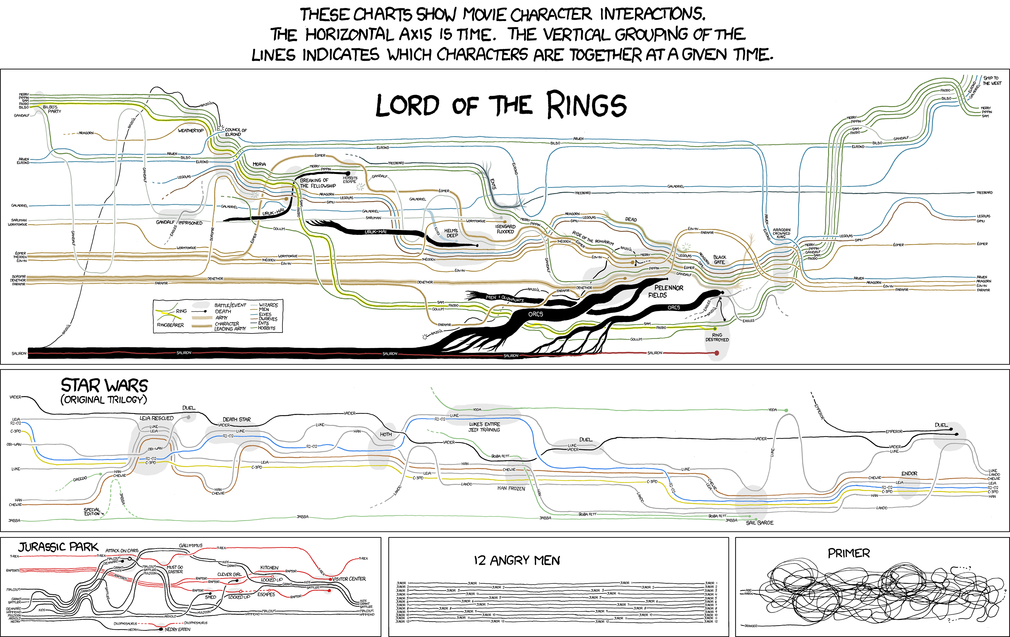
Figure 10.3: This is a funny variation of the famous “March on Russia” graphic, but looks at plots of famous movies.
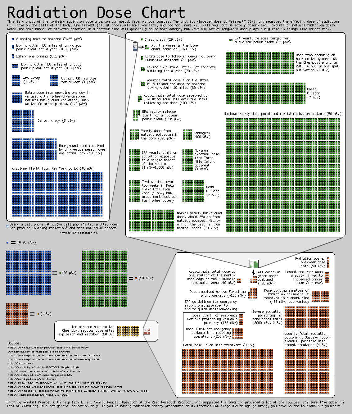
Figure 10.4: This plot shows the scales of different sources of radiation, trying to point out that radiation is not an “ON/OFF” phenomena. This graph was produced by Randal Monroe in the wake of the Fukushima disaster and is discussed here.
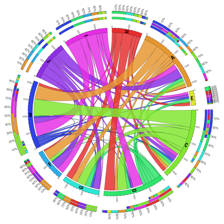
Figure 10.5: These “circos” graphs were developed to show how genes interact with each other.
10.1 Introduction to Matplotlib
NoteOther plotting packages
There are several other options for plotting in Python. Each package below generally tries to focus on making graphs look nicer by default since TBH Matplotlib’s default formatting is rather bland.
Matplotlib is the main package for plotting in Python. There are several other contenders which offer their own perspectives on plotting, but Matplotlib is really all we need.
Matplotlib is part of the Numpy/Scipy ecosystem of packages. It is designed to work with Numpy arrays.
We have seen several examples of Matplotlib graphs already in the course notes, but now we’ll take a deep dive into how we get the plots we want. Matplotlib also offers a gallery of sample plots, with code to get you started.
10.1.1 The Standard Charts
10.1.1.1 Scatter Plots
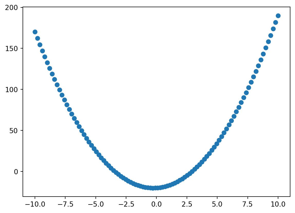
The scatter plot, or x-y plot, is probably the most useful and commonly used type of plot. It allows us humans to see trends and relationships instantly.
import numpy as np1import matplotlib.pyplot as plta, b, c =2, 1, -20x = np.linspace(-10, 10, 100)y = a*x**2+ b*x + c2fig, ax = plt.subplots()3ax.scatter(x, y);
1
Matplotlib offers two ways to interact with it: pylab and pyplot. pylab is more familiar to Matlab users. All serious Python programmers use pyplot. The downside of this flexibility is that the import statement is annoyingly long!
2
This is the standard way to invoke a new empty plot. All plots consist of a main figure (fig) which contains one or more axis objects (ax). The subplots() function returns the “handles” to both so we can edit their properties as needed later.
3
Here we tell the ax object to populate itself with a scatter plot of the x and y data. The trailing semi-color (;) is not needed but it surpresses any text which may be emitted by this function.
NoteFigure and Axis Handles
The concept of a “handle” is common throughout programming. It is not an arcane inscrutable term…it means exactly what it sounds like: it allows you to hold and manipulate an object! It has exactly the same role for a computational object as for objects in the real world. Consider coffee:
(a) subplots(3)
(b) subplots(2, 3)
Figure 10.6: A physical analogy to the concept of figure and axis handles. The carrying caddie is the figure handle, the coffee cups are the axes handles, and the steaming hot coffee is the data.
Matplotlib has some features for dealing with these handles, like finding one that you’ve lost.
This will retrieve the axes handles which are contained within fig
3
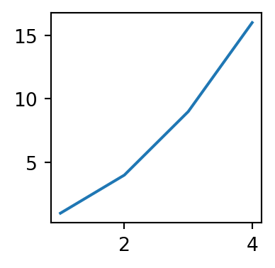
Here we’ve used the plot function, which is almost identical to scatter except x-data is optional, in which case it will plot the y-data vs a range like range(len(y)). It is less powerful than scatter as well, in the sense that you can’t color or size each data marker separately. It is convenient though if you just want a really quick plot of some data.
import matplotlib.pyplot as pltx, y = [1, 2, 3, 4], [1, 4, 9, 16]1plt.subplots(figsize=[2, 2])2fig = plt.gcf()3ax = fig.axesax[0].plot(x, y)
1
Assume we don’t have any handles
2
We can get the handle to the currently active (i.e. most recently created) figure
3
The we can grab the axes too
Customizing the formatting of Matplotlib plots can become quite verbose since there are so many options!. Let’s look at a few of the normal options:
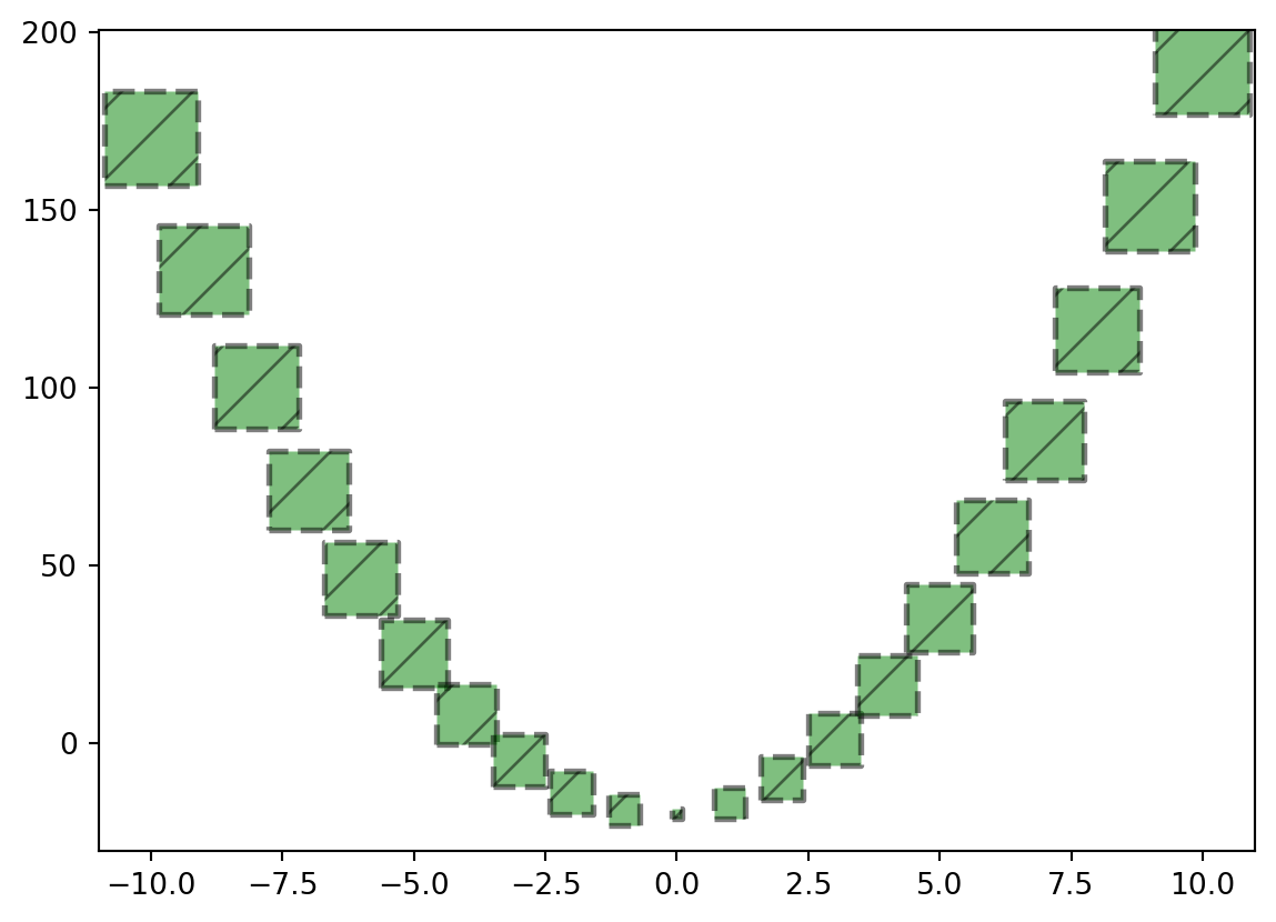
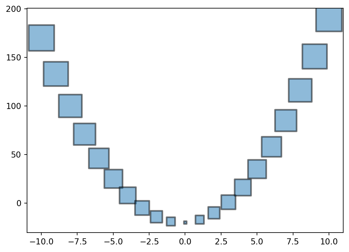
a, b, c =2, 1, -20x = np.linspace(-10, 10, 21)y = a*x**2+ b*x + cfig, ax = plt.subplots()1ax.scatter( x=x, y=y, s=np.abs(x*100) +10, c='r', marker='s', alpha=0.5, edgecolors='k', linewidth=2,2)3ax.set_xlabel('Some X Values')ax.set_ylabel('Some Y Values');
1
This code style is allowed by PEP8 and is quite helpful when a function has many arguments. This layout not only allows the coder to see each argument clearly, but it’s also easy to add and remove arguments by just inserting/deleting lines. Even the closing bracket is on its own line so that every argument can be easily adjusted in this way.
2
This is a complete list of the arguments that are listed in the scatter() function’s docstring, BUT there is another huge list of options that can be passed to (almost) any plot. This will be explored below.
3
Here is an example of applying some formatting to an axis using the ax handle. There are a lot of things we can do here, which will also be explored below.
As mentioned above there are many more arguments that can be passed to matplotlib functions. In the following code block we use keyword-unpacking introduced in Chapter 7. We will put all our desired properties into a dict, then pass it to the function:
This entry and the next are examples of extra arguments that are accepted by most plot types.
2
Here we pass all the values in the formatting_argsdict using the ** notation which tells Python to assign each “key” to the corresponding keyword argument.
For the sake of completeness, let’s also review the positional argument unpacking as well:
These need to be in the same order as they are expected by the scatter() method since the * notation indicates these are unpacked as “position arguments”.
2
Here we have unpacked the positional arguments first followed by the keyword arguments. Note that this is the rule whether using unpacking or not.
10.1.1.2 Histograms and Bar Charts
Figure 10.7: It would be great if printers actually worked this easily.
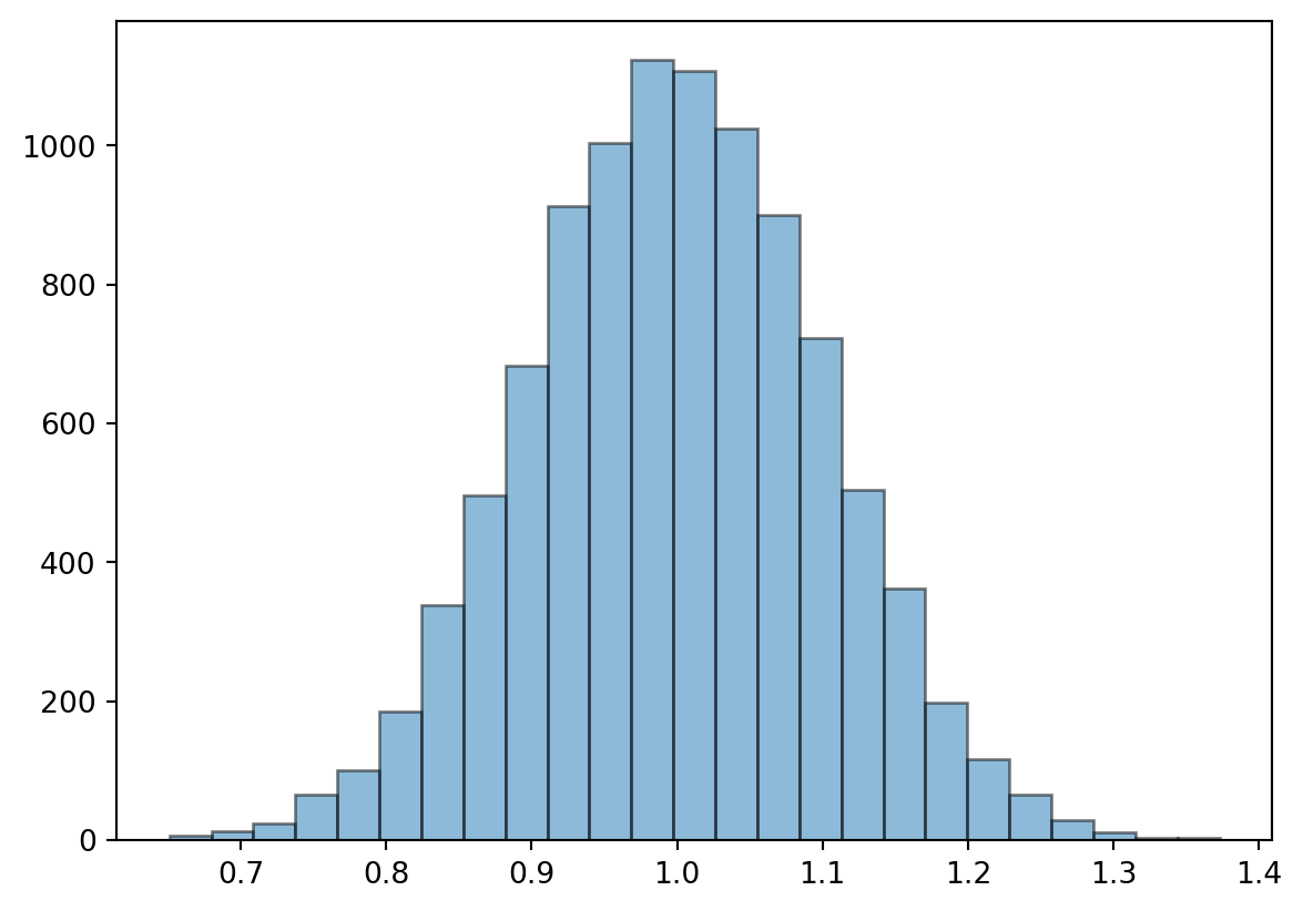
Bar charts are a common option when plotting statistical distributions of data. We talked briefly in the last chapter about how to use Numpy to generate data following different common distributions.
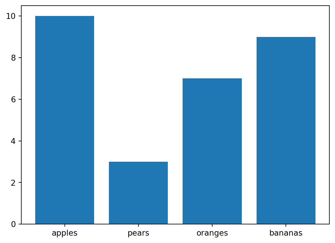
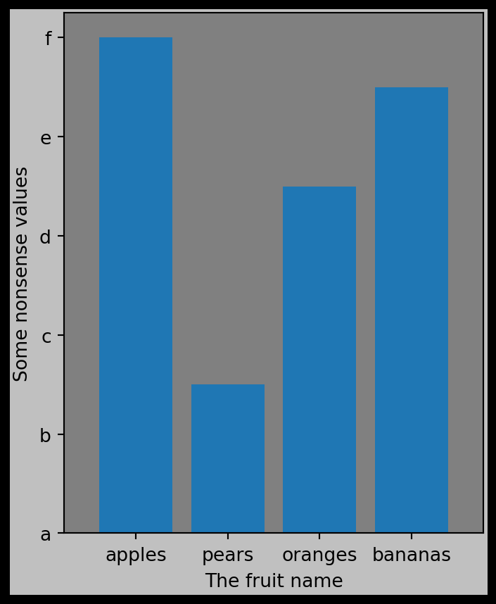
Another common use of bar charts is when the ‘x-axis’ is a category rather than a numerical value. Matplotlib lets us specify both an ‘x’ location for the bars,and individual labels:
It is not necessary to store the data in a dict but it is obviously quite convenient.
2
Since the data are in a dict we can use use keys() as the x-coord (i.e. category) and vals() as the y-coord (i.e. height of the bars).
10.1.2 Formatting ax and fig objects
NoteGetters and Setters
In programming there is a “design pattern” called getters and setters. This means functions which “get” data and functions which “set” data. It is common for these functions to start with the words get and set. In Table 10.1 we can see all the set methods on ax objects, but there are also a lot of get methods too.
In fact, when you write data to a dict in Python, like d[item] = value, behind the scenes Python actually runs a hidden function called __setitem__() with item and value as arguments like d.__setitem__(item, value). You can try this yourself! You can also retrieve data using d.__getitem__(item).
In the above sections we saw how to format the “data”, such as marker colors and sizes. We also often want/need to format the graphs themselves, like axis limits and background colors. The ax and fig objects have a lot of methods attached to them which allow us to manipulate the formatting. Of this huge list, the ones that start with set are for “setting” properties. Below is a list of methods on the ax objects. A similar selection of methods can be found on the fig object as well.
Table 10.1: List of all method attached to an axis object
Note: This graph does not look very good. This is just a demonstration of how to go about making it look good.
10.1.3 Named Colors and Color Maps
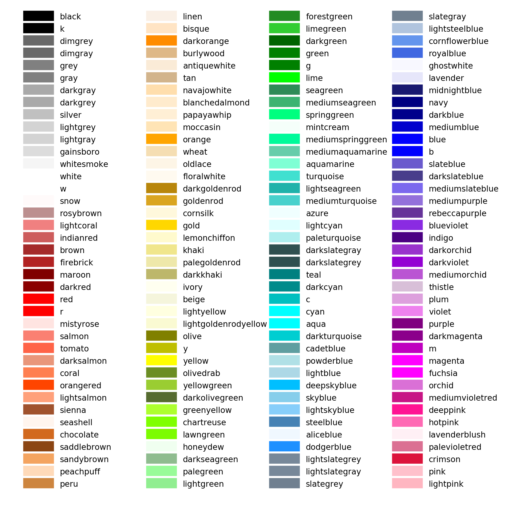
Specifying colors is one of the main ways which we customize plots. Matplotlib has a large list of “named colors” which can be passed to any of the color-related argument like set_facecolor(). These colors are given below:
Figure 10.8: Table showing the officially recognized “named colors” in Matplotlib. More information can be found in the documentation.
Matplotlib also has a small subset of colors which work well together called the “tableau palette”. These are shown below:
Figure 10.9: The subset of colors known as the “tableau palette” which work well when plotting many datasets together.
And here is an example of using the “tableau palette” when combining 4 different data sets.
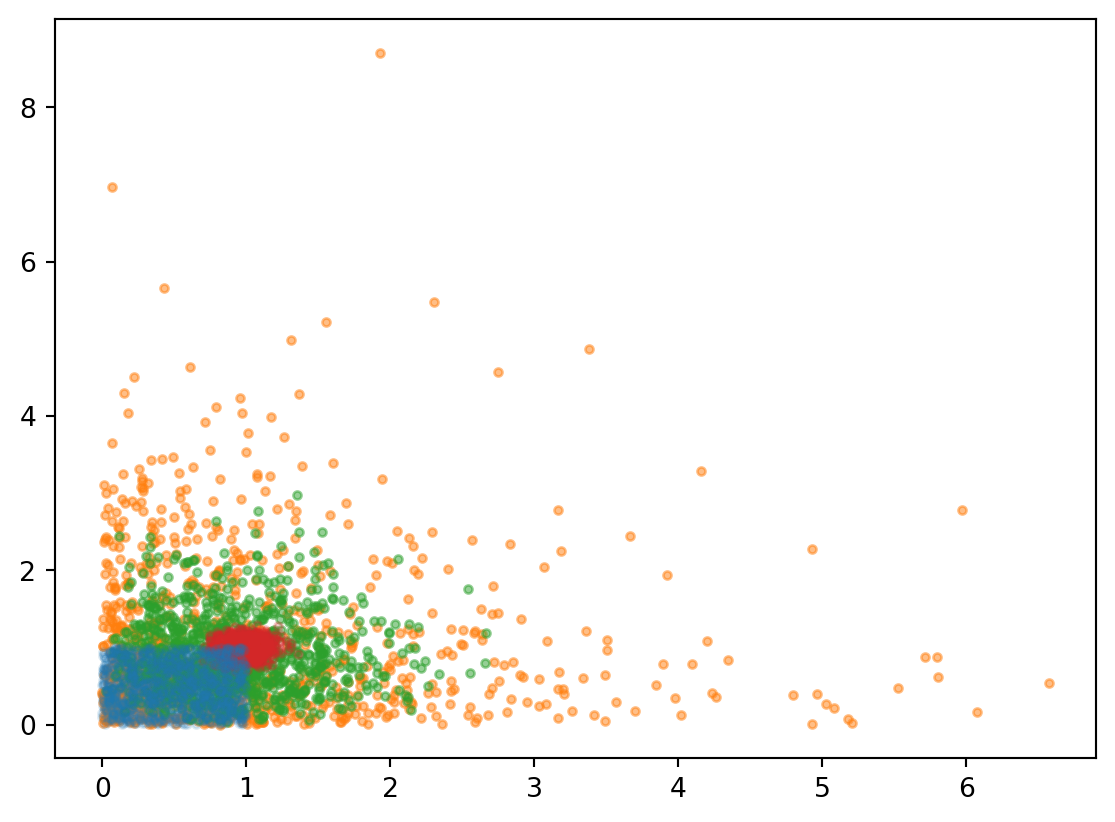
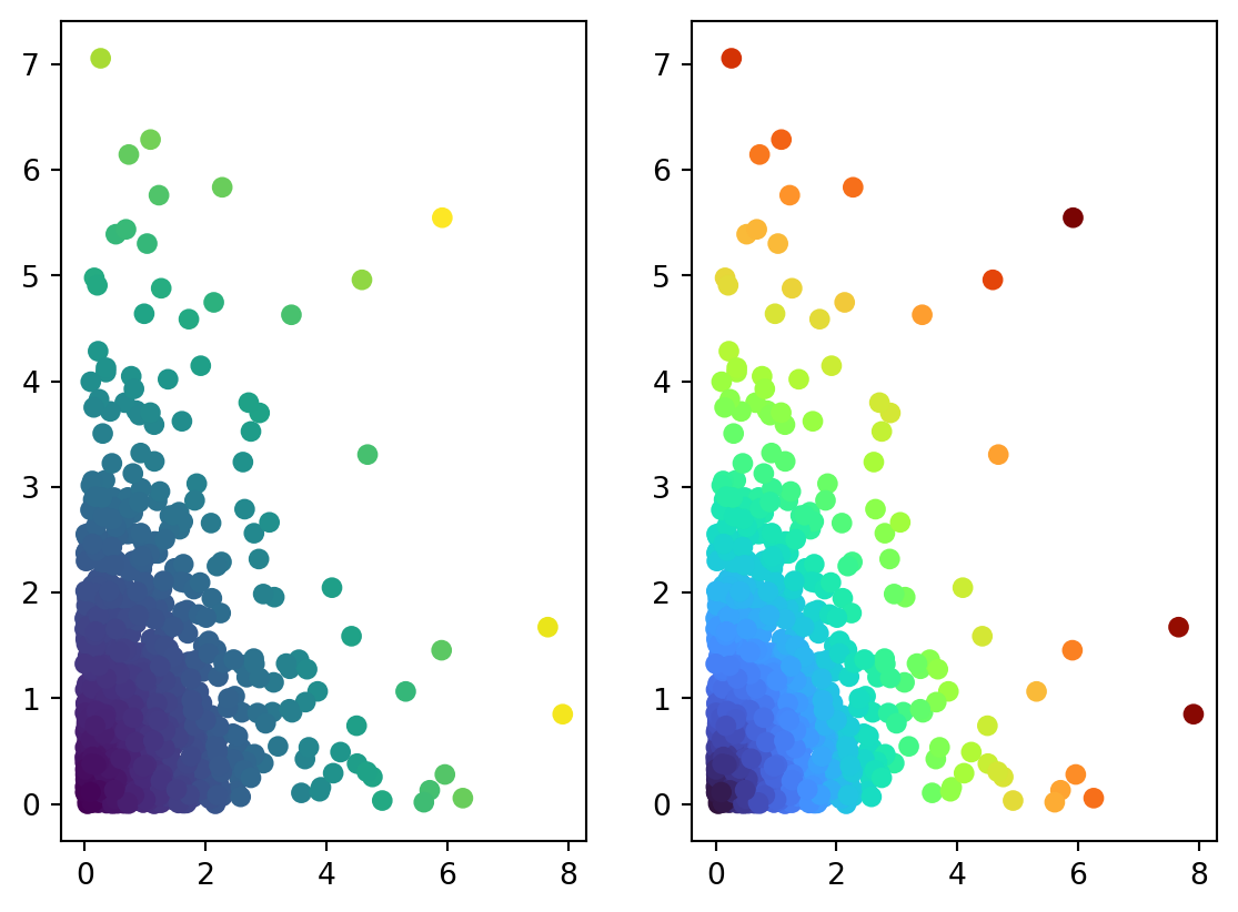
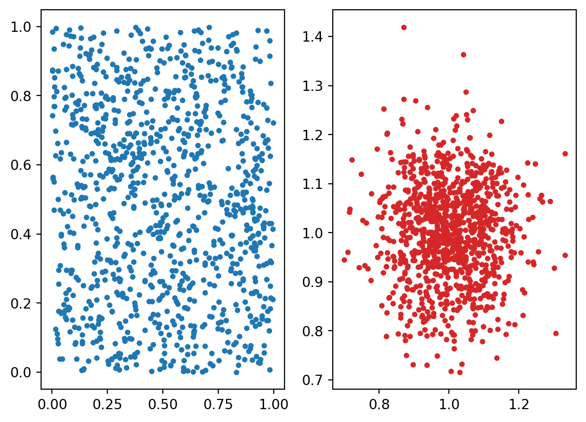
Another way to use colors effectively is assigning each data point some different color based on some additional value other than just “x” and “y” locations.
x, y = np.random.gamma(scale=1, shape=1, size=(2, 1000))color = (x**2+ y**2)**0.51fig, ax = plt.subplots(1, 2)2ax[0].scatter(x, y, c=color)3ax[1].scatter(x, y, c=color, cmap=plt.cm.turbo)
1
Here we create 2 subplots, which we’ll explore in more detail in the next section
2
We assign the array color to the c argument and Matplotlib will color each marker accordingly
3
We can override the default color map by passing a colormap to the cmap argument
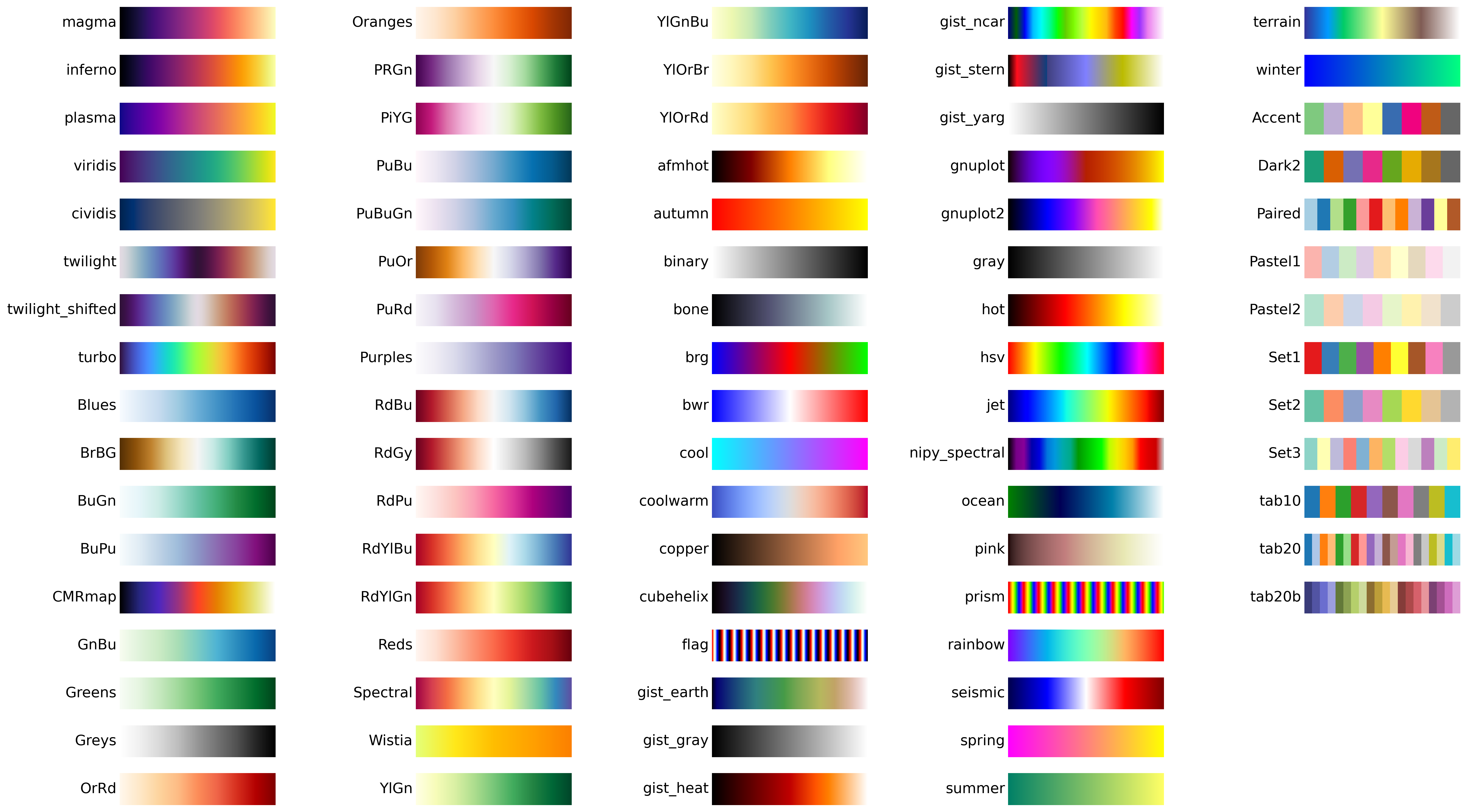
There are quite a few colormaps provided by Matplotlib, as shown below:
Figure 10.10: Overview of available colormaps. See the Matplotlib documentation for more information and categorizations of the different maps.
A good tutorial on the subject of plotting with colors is given here
10.1.4 Multiple Plots
NoteMatplotlib Gallery
The Matplotlib Gallery contains hundreds of examples to use as a starting point. You can browse this page until you find something that looks close to what you want.
It is pretty common to plot two things side-by-side, or even an N-by-N grid. Using the plt.subplots() function as our default approach allows this easily:
Here we create a 2-by-2 grid of axes, and catch all of them in ax
2
To add data to each axis we need need to index into the ax collection according to the “row” and “column” location we want.
There is another version of the subplots() approach called subplot_mosaic() which is interesting since it gives us quite a lot of control over the layout. Instead of just a regular grid, we can do the following:
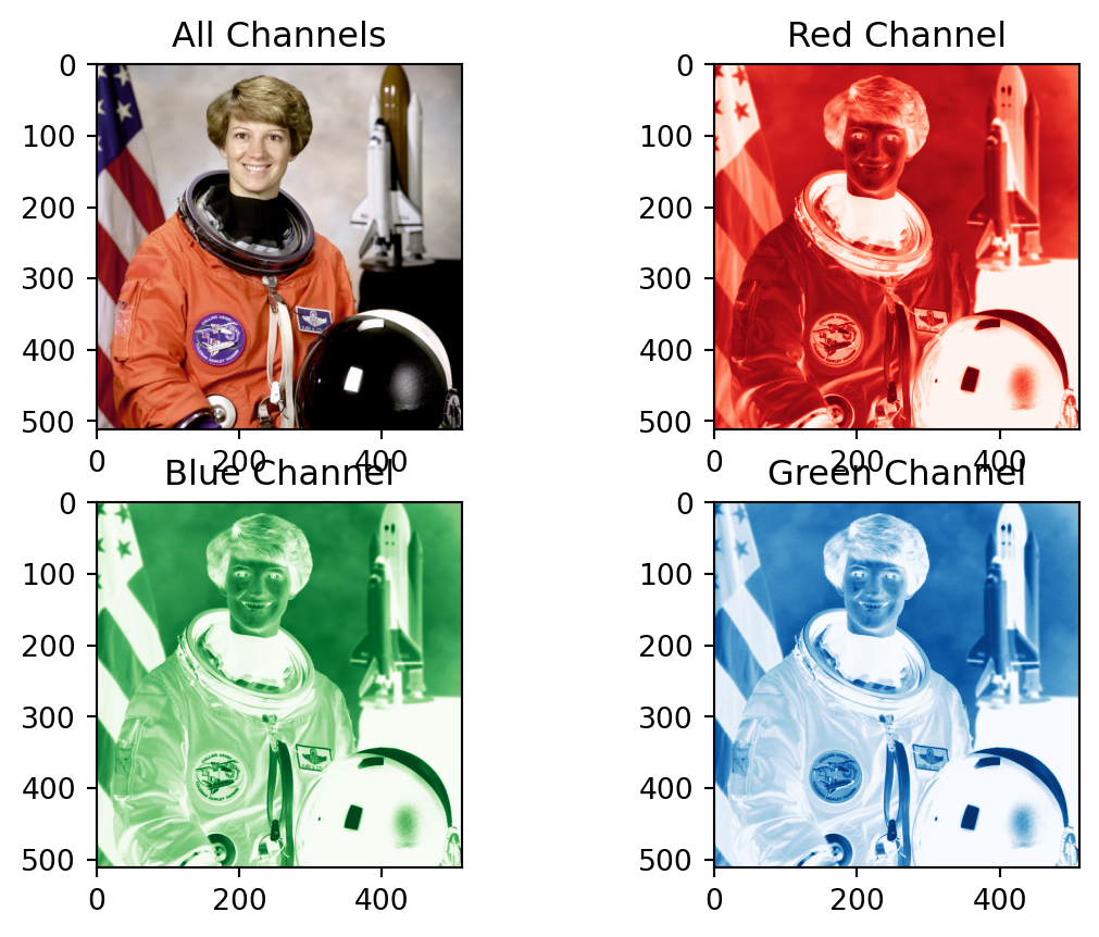
The “png” format stands for “portable network graphics”. It has the usual three “RGB” “channels”, but also has a 4th “channel” which is the transparency. In the case of a normal photo, there is no transparency. In cases like logos we might want only the logo and letters to show up, and all the background to disappear.
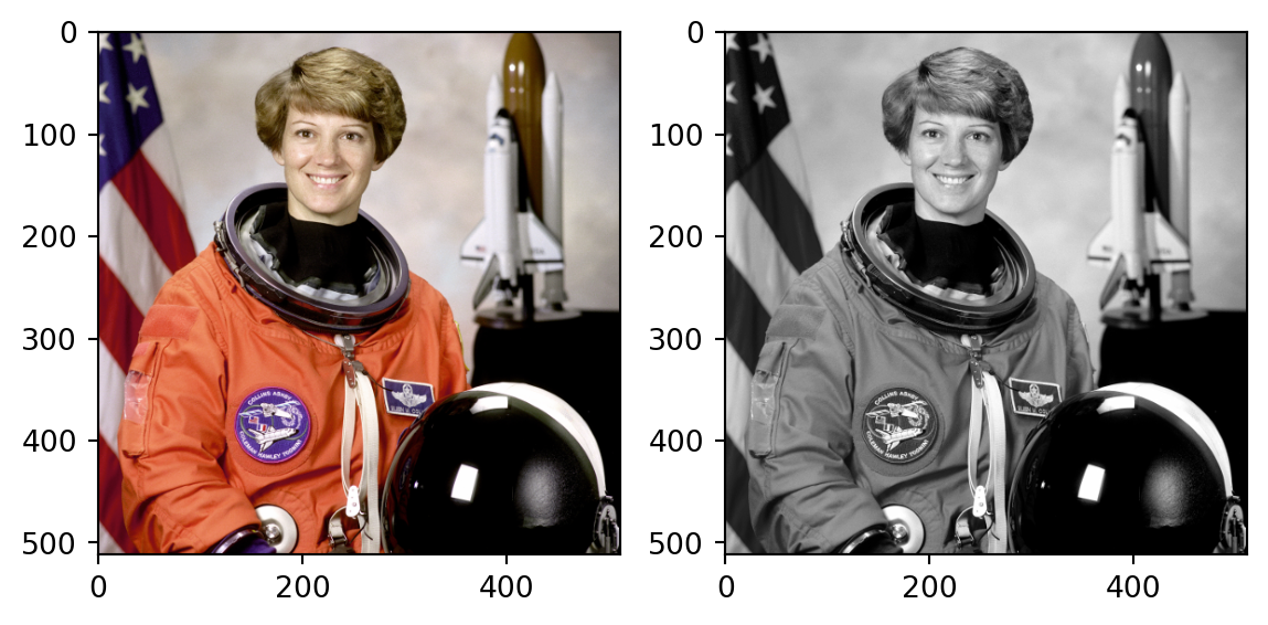
Let’s look at this in greyscale. Greyscale is a very powerful way to present information. It means that each pixel is a value between 0 and N. This can be used to represent some precise numerical value like elevation, or labels to indicate different regions like countries.
The scikit-image package is part of a family of scikit packages. The name is meant to invoke a connection with scipy, and they are like additional toolboxes that are too specific to be included within scipy. These packages are generally abbreviated as sk<name> since python package names cannot have dashes (-) in them. scikit-learn and scikit-image are the most popular scikit packages. They are abbreviated as sklearn and skimage.
2
This line discards the 4th channel that controls the transparency. Also note that we have introduced a new slicing syntax: .... Three dots are called an ellipses. This means “give me all the first N axes, but only 3 steps along the last axis.”
10.2 Introduction to Jupyter Notebooks
NoteThe name Jupyter
Jupyter notebooks were originally called IPython Notebooks, where the “I” stood for “interactive”. The package was enhanced to allow any language for the backend, not just Python, so a new name was required. The word Jupyter is a partial anagram of “JUlia, PYThon, R”, which are three languages used by programmers doing numerical computations. The reference to the planet Jupiter was to indicate the strong gravitational pull of the planet pulling several hundred moons into its orbit. The programming languages are like the moons. It seems this metaphor was appropriate since there are hundred of kernels available now.
Note that notebooks still have the .ipynb file extension regardless of which language was used within it.
In this course so far we have been focusing on using “IDEs”, but “Jupyter Notebooks” are quite popular so are worth introducing. They are a web-based pseudo-IDE. Jupyter Notebooks offer the following two benefits:
You can mix programming-related information like code, outputs, and graphs with text-based information like headings, explanations, and equations.
Once a notebook is complete you can save it to a permanent format like a PDF file to be shared like a normal document.
So basically, Notebooks are a way to share the results of our computations with others. They have become a popular way for programmers (such as ourselves) to do quick calculations because they make it easy for us to remember what we did and why (assuming we included good explanations!).
To launch the Jupyter environment, you can do either:
Open Anaconda Navigator and click “Launch”
Open the (Ana)conda prompt, and type jupyter notebook
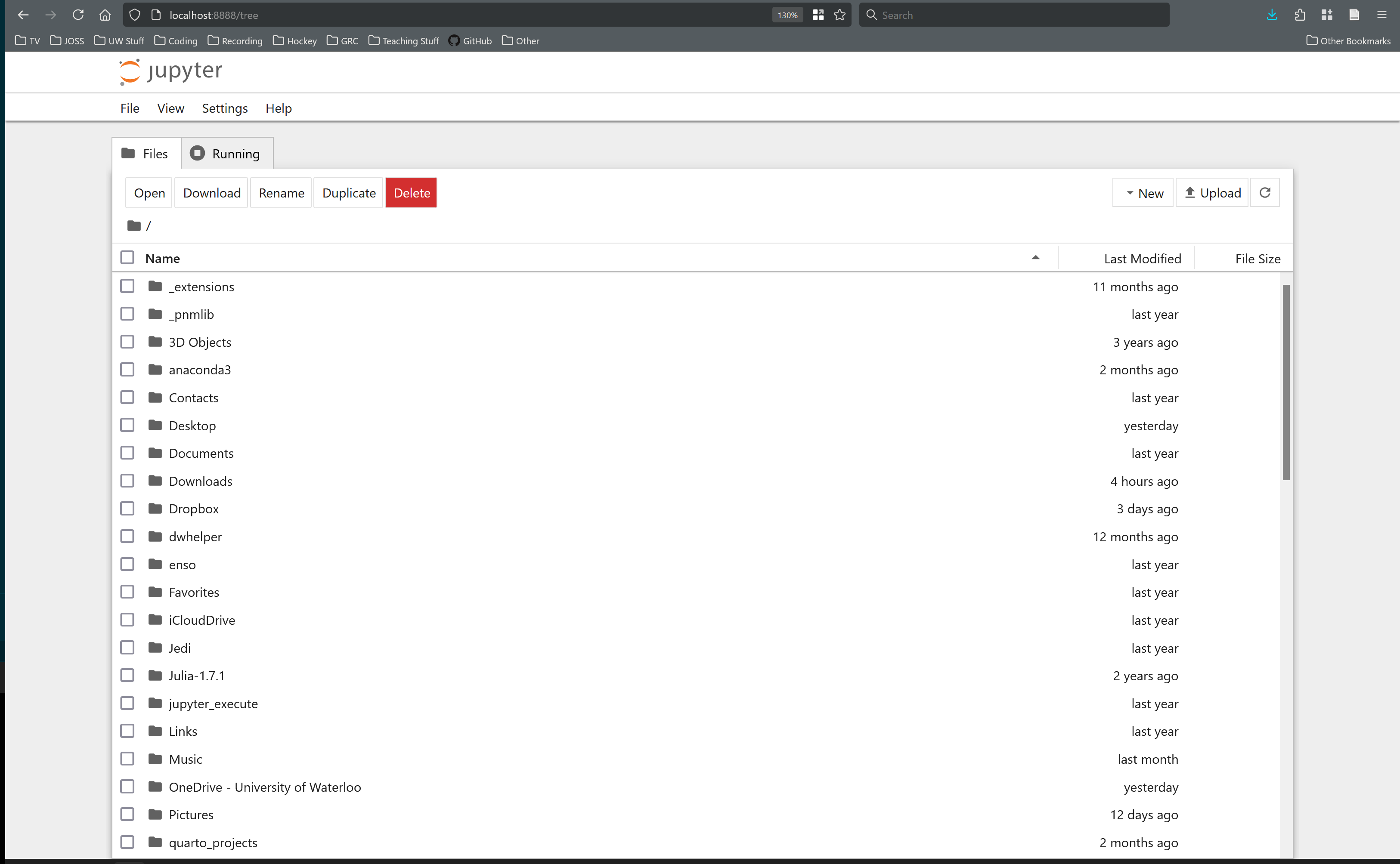
You will end up seeing something like the following in your web-browser:
Figure 10.11: Left shows the file browser and right shows the notebook itself.
Notebooks are based on the concepts of “cells”.
Each notebook is a linear series of cells
Cells can contain either text or code
The output of code cells is rendered immediately below the cell
Text cell can be formatted with a syntax called Markdown
Text cells can also contain equations written using Latex syntax
NoteJupyter shortcut keys
When working with any program it is extremely useful to learn the shortcut keys. A list of shortcut keys for Jupyter is given in Appendix H.
Example 10.1 (Compute the average temperature in each month) Given the weather data from the UW Weather station, download the data for 2023 and compute the average temperature of each month.
Solution
Open Jupyter Notebook and follow along by pasting the following code blocks into cells.
First import all the needed packages and load in the data file
import pandas as pdimport matplotlib.pyplot as pltimport numpy as npurl ="http://weather.uwaterloo.ca/download/Hobo_15minutedata_2023.csv"df = pd.read_csv(url, low_memory=False, index_col=False)
Now let’s quickly plot the data to see how it looks:
plt.plot(df['Temperature'])
The seem to be some wonky numbers which need to be removed, probably from the temperature sensor malfunctioning:
T = np.array(df['Temperature'])mask = (T >-60.) * (T <50.)plt.plot(T[mask])
Let’s make a new time column that is a bit more intuitive, and plot vs that. Let’s also color code the data points by month so it’s easier to see the trends:
temp = np.ones_like(T)*15df['elapsed minutes'] = np.cumsum(temp)df['elapsed days'] = df['elapsed minutes']/60/24fig, ax = plt.subplots(figsize=[5, 5])ax.scatter( x=df['elapsed days'][mask] , y=df['Temperature'][mask], s=0.1, c=df['month'][mask], cmap=plt.cm.Set3,)ax.set_xlabel("Elapsed time since January 1 [days]")ax.set_ylabel("Temperature [C]")
Finally, we need to find the average for each month.
df['monthly average temperature'] =0.0for i inrange(1, 13): month = df['month'] == i T = df['Temperature'][month] mask2 = (T >-50) * (T <50) T = T[mask2] ave = np.average(T) df.loc[month, "monthly average temperature"] = ave
And let’s plot a line for the average on top of the instantaneous values:
ax.plot( df['elapsed days'][mask], df['monthly average temperature'][mask], 'k-', linewidth=0.5,)ax.set_facecolor('darkgrey')fig
Comments
Using the “File/Save and Export Notebook As/Webpdf” function in Jupyter itself only works if you have the correct software installed, but this is a pain to do. Follow the instructions in the error message and do pip install <suggested package>.